

Misleading Monckton claims that there has been a “pause” in global warming since 2015 based on a surface temperature dataset. This claim ignores that global warming continues, as documented in datasets of ocean heat content, global ice cover and sea-level rise among other sources.

AFFIRMATION COMPLETE: “...Seven and a half years have passed since there was any trend in global warming at all” “[Temperature] has been rising in occasional spurts in response to natural events such as the great Pacific shift of 1976 and the subsequent strong El Niño events, rather than at the somewhat steadier rate that one might expect if our continuing – and continuous – sins of emission were the primary culprit.”
A recent article in Watts Up With That, a blog with a long history of publishing scientifically unfounded claims, authored by Christopher Monckton argues that there has not been any global warming over the last 7 and a half years. Monckton, a former British politician with formal training in classics and journalism, further claims that past increases in temperature have been caused by natural processes such as “the great Pacific shift of 1976 and the subsequent strong El Niño events”.
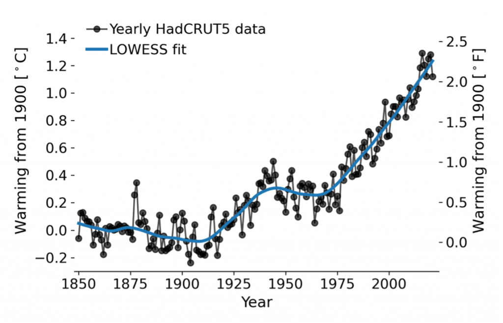
The argument that global warming has paused or stopped is not a new one. Climate science contrarians previously made this argument over a decade ago, using an apparent warming hiatus from 1998 to 2010 in an attempt to discredit emissions-driven global warming. Such claims, which have been previously assessed and debunked by NASA climate scientist Gavin Schmidt[1], rely upon a limited selection of data and ignore the long-term warming trend in global mean surface temperature (Fig. 1). Schmidt notes that this technique is disingenuous and statistically flawed because “looking at only 8 years of data is looking primarily at the ‘noise’ of interannual variability rather than at the forced long-term trend. This makes as much sense as analyzing the temperature observations from 10-17 April to check whether it really gets warmer during spring.”[1]
Monckton’s recent claim is no exception, as the author uses only 7 and a half years of surface temperature data (from 2015 to 2022) in order to cast doubt on the large consensus of scientific evidence which demonstrates that surface temperatures are warming due to human greenhouse gas emissions.[2-5] This is an example of cherry picking data, selecting only a small subset of the available data in order to advance the author’s narrative, and leads Monckton to make the erroneous claim that natural shifts in climate, such as those caused by variations in the Pacific Ocean, have been responsible for surface temperatures rising “in occasional spurts ». However, global surface temperature observations reveal an unabated increasing trend since the early 1960s (Fig. 1), with only short term fluctuations around the trend.

Figure 1. Global mean surface temperature (GMST) trend over the last 170 years. Black dots represent monthly temperature observations. The yellow line represents the modeled human contribution to temperature rise whereas the blue line represents the influence of natural (non-human) variability on temperature. The red line represents the combined modeled temperature response to both human-caused and natural temperature change. The fact that temperature observations track the red line but not the blue line indicates that human activities such as greenhouse gas emissions can explain modern global warming, but natural processes cannot. Source: Globalwarmingindex.org.
Robert Jnglin Wills, a scientist at the University of Washington who studies the role of atmospheric and oceanic circulation in climate, commented, “It is well understood that global temperature changes result from a combination of anthropogenic greenhouse gasses and internal climate variability such as El Niño [a source of natural variability in the Pacific Ocean invoked by Monckton]. Anthropogenic global warming dominates the multi-decadal trends, while internal variability is important for trends up to a few decades.”
El Niño events are a part of a natural variation in Pacific Ocean circulation patterns called the El Niño Southern Oscillation (ENSO). Two phases of ENSO exist: the El Niño mode and the La Niña mode, which give rise to distinct weather conditions around the planet.[6] During an El Niño event, trade winds weaken. These winds are responsible for driving the circulation of relatively warm surface waters from South America to Asia, and so weaker winds under an El Niño event result in an accumulation of warmer surface waters in the eastern Pacific but relatively less warming in the deeper parts of the ocean. By contrast, strong trade winds characteristic of a La Niña event result in an increase in temperature in deeper parts of the western Pacific but cooler conditions at the surface.
In the tropical Pacific Ocean, sea surface temperatures are therefore relatively warmer during El Niño events but relatively cooler during La Niña events (Fig. 2). Due to the enormous size of the Pacific Ocean, sea-surface temperature variations in this region strongly influence globally averaged surface temperature datasets.[6]
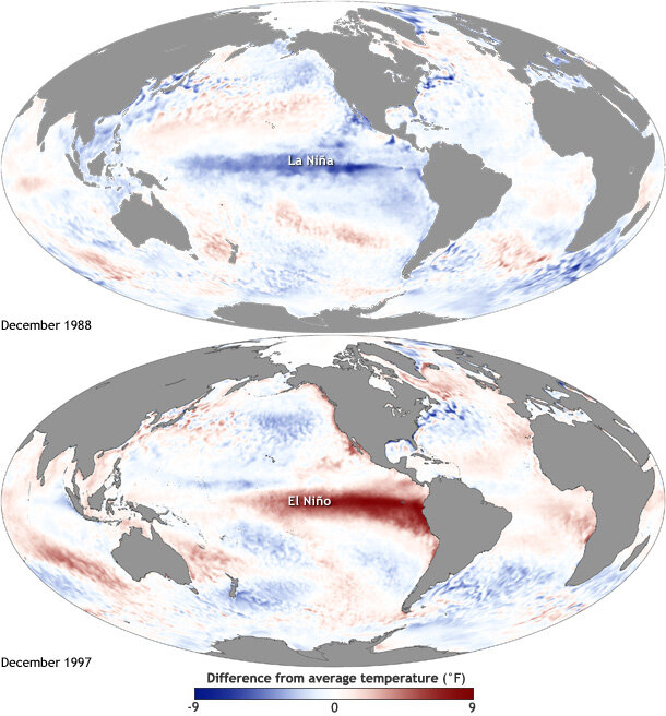
Figure 2. Departures in sea surface temperatures from average conditions during a La Niña event in 1988 and an El Niño event in 1997. Source: NOAA.
As such, it is typical for the warmest year in a given decade as recorded by surface measurements to correspond to an El Niño event whereas the coolest year in a given decade is usually associated with a La Niña event (Fig. 3). Importantly, this does not indicate that the planet gains heat during an El Niño event or loses heat during a La Niña event, but rather that there is a redistribution of heat between the deep ocean (which is warmer than average during a La Niña event) and the planet’s surface/lower atmosphere (which is warmer than average during an El Niño event).

Figure 3. Annual globally averaged surface temperature separated by decade. Note that most of the warmest surface temperature years in a given decade occur during El Niño events (red dots) and that most of the coldest surface temperature years in a given decade occur during La Niña events (blue dots). This is due to the vast size of the Pacific Ocean, which strongly influences globally averaged surface temperature datasets. Source: NOAA.
Despite the transient influence of these events on globally averaged surface temperature during a given year, the data clearly demonstrate an increase in surface warming regardless of ENSO activity (Fig. 2). Monckton’s claim that large El Niño events after 1976 drove recent increases in surface temperature is therefore not supported by the data. In fact, a recent study by Cheng et al. found that ocean surface temperatures actually reached another all-time high in 2021 despite the cooling effect derived from the concurrent La Niña event.[7]
So, what about that “pause” in global warming over the last 7 and a half years that Monckton discusses? In the blog post, the author uses a relatively stable trend in satellite temperature measurements and the HadCRUT4 dataset, a global compilation of surface temperature data produced by the Met Office Hadley Centre and Climatic Research Unit at the University of East Anglia[8], from 2015 to present as evidence for such a pause. However, because an El Niño event occurred from 2015 to 2016, some cooling relative to 2015 is expected and so choosing this year as a baseline is problematic. As Inglis notes, the interval selected by Monckton is “…cherry-picked to maximize the cooling trend following the El Niño event relative to the long-term anthropogenic warming trend.”
Further, had Monckton included data from the subsurface ocean, which stores most of Earth’s excess heat (Fig. 4), the author would have identified a relatively linear increase in warming (Figs. 4 and 5). In fact, when considering all relevant climate indicators such as ocean heat content, sea-level change and global ice cover, the World Meteorological Organization identified an acceleration in the rate of climate change from 2015 to 2019, not a pause.[9] It is therefore misleading to claim that global warming has not occurred since 2015 and Monckton’s exclusion of additional climate datasets is another example of cherry picking.
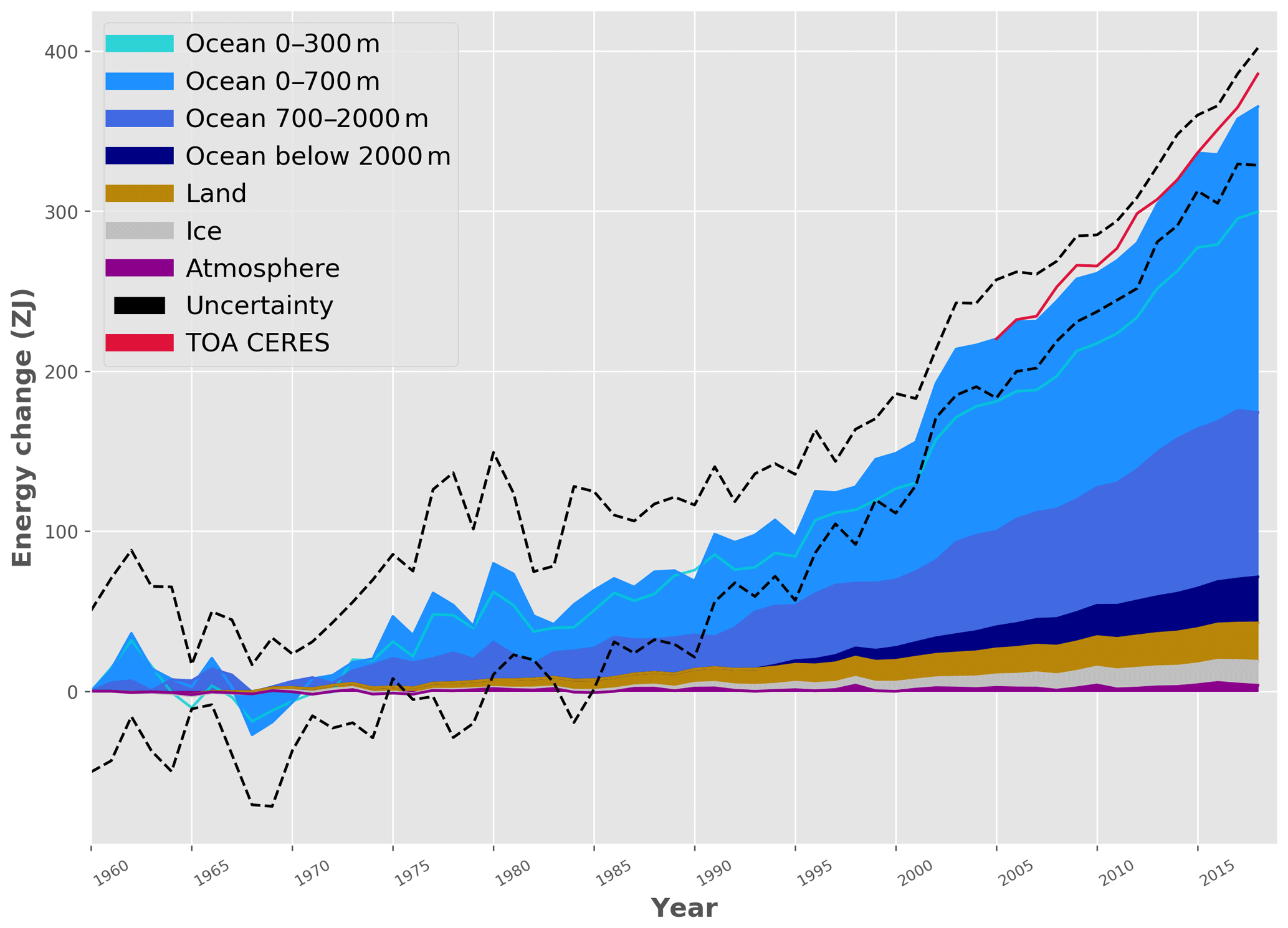
Figure 4. Time series of excess energy in the ocean, land, ice and atmosphere. The vast majority of excess energy caused by global warming is stored in the upper 700 m of the ocean. Note that ocean heat content has increased since 2015, contrary to Monckton’s claim that global warming has “paused” over this period. Source: von Schuckmann et al. (2020).[10]
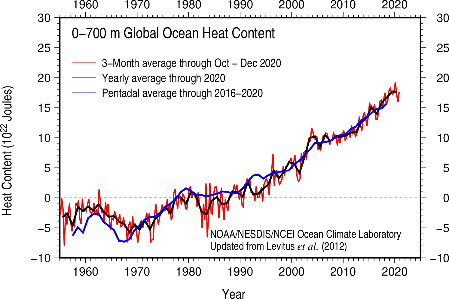
Figure 5: Time series of global ocean heat content from 0 to 700 m depth (where most ocean heat storage occurs). Note that ocean heat content has increased linearly since 2015, contrary to Monckton’s claim that global warming has “paused” over this period. Source: NOAA.
As has been documented by an overwhelming consensus of scientific evidence[2-5], anthropogenic greenhouse gas emissions are the main driver of modern global warming. This was recently verified again by the Sixth Assessment Report of the Intergovernmental Panel on Climate Change (IPCC), which states that “it is unequivocal that the increase of CO2, methane (CH4) and nitrous oxide (N2O) in the atmosphere over the industrial era is the result of human activities and that human influence is the principal driver of many changes observed across the atmosphere, ocean, cryosphere and biosphere” including global warming.[11]
Monckton’s alternative conclusion that greenhouse gas emissions cannot be responsible for modern global warming is rooted in the author’s misrepresentation of equilibrium climate sensitivity, the level of global warming expected from a doubling of CO2 emissions. Citing Zelinka et al. (2020)[12], Monckton claims that climate scientists base their predictions of emissions-driven warming by first “imagining” that all warming is driven by CO2 and then back-calculating the impacts of emissions on absolute temperature. The author goes on to use an invented formula involving absolute temperature to assert that the impacts of CO2 on warming are negligible, a claim which is not supported by the scientific literature[11].
According to Wills, Monckton’s technique to recalculate emissions-driven warming is flawed because “whether it is calculated from models or observations, [equilibrium climate sensitivity] is a calculation about how the climate system responds to a perturbation away from an equilibrium state (e.g., warming in response to greenhouse gas emissions) and the absolute temperature is not a part of the calculation.” Indeed, this is true of the climate models evaluated in both Zelinka et al. (2020)[12] and the compilation of estimates from models and observations in the latest IPCC report.[11]
Note that this article was updated on April 14, 2022 to include additional comments from Mark Richardson.
REVIEWERS’ FEEDBACK
This article relies on cherry-picking and misconstruction of our knowledge of the climate system to argue that the role of anthropogenic greenhouse gasses in global warming has been overblown. It is well understood that global temperature changes result from a combination of anthropogenic greenhouse gasses and internal climate variability such as El Niño. Anthropogenic global warming dominates the multi-decadal trends, while internal variability is important for trends up to a few decades. The article selects a 7-year period following a large El Niño event in 2015-16, which is cherry-picked to maximize the cooling trend following the El Niño event relative to the long-term anthropogenic warming trend. It then acknowledges that cherry-picking and responds by further cherry-picking, calculating a trend back to 1850, which is muted by the weak greenhouse gas forcing prior to the 20th century, and comparing that against a somewhat high estimate of 1.8°C global warming by 2030 from the IPCC first assessment report in 1990.[13] Methods to estimate the future warming trend have improved since 1990, but this early estimate is still within the range of global temperature changes of 1.2-1.8°C (relative to 1850-1900; very likely range) that are predicted for the 20-year period 2021-2040 by the most recent IPCC report[11], showing just one example of how accurate early predictions of global warming were (one that was cherry picked because it was not as good as others). This article then goes on to misconstrue the physical understanding of global warming based on climate feedbacks, arguing that climate scientists ignore the warming of the earth by pre-industrial (non-anthropogenic) greenhouse gasses and the sun. In contrast, understanding of the role of greenhouse gasses and solar forcing in setting the pre-industrial temperature is foundational to the understanding of how much global temperature will rise in response to anthropogenic CO2 emissions.
Mark Richardson, Postdoctoral scholar, Jet Propulsion Laboratory, California Institute of Technology:
This blog misleads readers with simple statistical mistakes and a discussion of climate physics that is basically gobbledygook.
The latest data shows ongoing global warming[17], here is data with a statistical fit that has been shown to accurately estimate longer-term changes.[18]
The 1.2 °C (2.2 °F) warming is obviously not a straight line[19], and the last decade rate is around 2.2 °C per century. The blogger mistakenly uses a straight line to claim just 0.5 °C per century recently, and also incorrectly calculates statistical uncertainties.[20]
Smaller year-to-year temperature jumps are often related to the Pacific El Niño-La Niña cycle. The figure below shows global temperatures in red and an El Niño dataset in blue.
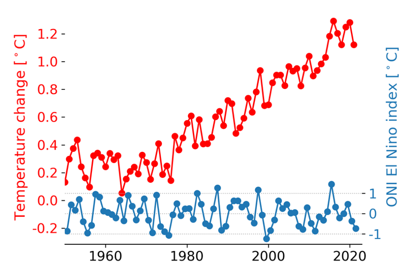
El Niño spikes trigger short-term warming, like in 1997/98 and 2015/16. The blogger claims some “great El Niño shift” in 1986 that isn’t in the data, and research has found that the Pacific has not acted to accelerate warming.[21,22]
The blogger begins one part of their analysis near the strong warming El Niño event of 2015/16 and ends during the recent extended La Niña event. By picking a short period with a strong El Niño-La Niña switch, the long-term trend is temporarily hidden. Notably, if you only look at years that were strongly affected by La Niña, 2021 is the warmest of them all.
El Niño and La Niña events have less effect on the Earth’s heat buildup. The left panel below shows measured ocean heat, and the right panel satellite-measured sea level changes. These show clearly that global warming is continuing.

The blog’s later claims about how climate models calculate climate change, with a reference to a 2020 study by Dr. Mark Zelinka and colleagues[12] and others are just detached from the reality of what those researchers did, and are so nonsensical that it’s not possible to judge them scientifically.
ANNOTATIONS
The statements quoted below are from the article; comments are from the reviewers (and are lightly edited for clarity).
“IPCC (1990, p. xxiv) confidently predicted 1.8 K global mean anthropogenic warming from 1850-2030.”
The value quoted is the “best estimate” from that IPCC report and does not include the full range of predicted values. For example, the most recent IPCC report[11] predicts 1.2-1.8°C of global warming (relative to 1850-1900; very likely range) for the 20-year period 2021-2040, with a best estimate of 1.5°C, and 2.8-4.6°C of global warming (relative to 1850-1900; moderately high emissions scenario; very likely range) for the 20-year period 2081-2100, with a best estimate of 3.6°C. For context, the IPCC Special Report on Global Warming of 1.5°C[14] compiles evidence that extreme heat, extreme rainfall, drought, ocean acidification, and associated impacts on ecosystems and human society will be greater at 2°C of global warming than at 1.5°C of global warming.
“To forestall the usual whingeing about “cherry-picking” from the climate-fanatical trolls, here is the entire HadCRUT4 record of monthly global mean surface temperature anomalies for the 172 years 1850-2021. The trend is a not particularly catastrophic half a degree per century equivalent. ”
Looking at the NASA GISTEMP observational temperature data between 1880 and 2018, Parsons et al. (2020)[15] show that 100-year trends have ranged between 0.35 °C/100 years (1880–1979) and 1.0 °C/100 years (1919-2018), with a median value of 0.69 °C/100 years. The higher trends in later periods reflect the increase in greenhouse gas emissions rate over time and show that the 0.54 °C/century reported in this article is on the lower end of what has been observed. Parsons et al. (2020)[15] also show that no climate model simulates 100-year trends as large as that observed over 1919-2018 unless they include anthropogenic greenhouse gas emissions.
“For 1850, the system-gain factor, by which one multiplies a direct warming (or reference sensitivity) to allow for feedback response and derive final warming (or equilibrium sensitivity) is not, as Hansen (1984), Schlesinger (1988) or Lacis (2010, 2013) absurdly imagined, 32 / 8 = 4. Instead, it is (255 + 32) / (255 + 8) < 1.1. Their error is as elementary as that.”
This is not how the equilibrium climate sensitivity (ECS) – the global warming in response to a doubling of CO2 – is calculated. The 4°C value given in Zelinka et al. 2020[12] is calculated from a mean of multiple climate models, and the models have an ECS range of 1.8 to 5.6°C. However, the IPCC Sixth Assessment Report[11] considers multiple lines of evidence including observations and states that there is high confidence that ECS is within the range of 2.5°C to 4°C, with a best estimate of 3°C. Whether it is calculated from models or observations, ECS is a calculation about how the climate system responds to a perturbation away from an equilibrium state (e.g., warming in response to greenhouse gas emissions) and the absolute temperature is not a part of the calculation.
“For every hillside is infested with whomping windmills – 14th-century technology to address a 21st-century non-problem. Birds, bees and bats by the billion are being blended or batted out of the sky. ”
“The State of the Birds 2014” Report estimates that 234,000 birds per year are killed by wind turbines in the U.S. compared to 2.4 billion per year killed by cats in the U.S. and 599 million per year killed by building windows in the U.S.[16]
“It will make no difference to global temperature. Even if all the nations bound by the Paris discords actually achieved net-zero emissions by 2050, as Mr Johnson fatuously proposes, the global warming abated would be little more than a twentieth of a degree, for most countries are not bound by it.”
This is misleading, because it talks about a scenario where only countries bound by the Paris Agreement reduce their greenhouse gas emissions, when the Paris Agreement is a framework for setting emissions targets and does not itself have binding emissions targets. The IPCC Sixth Assessment Report on the Mitigation of Climate Change estimates that a scenario with an 85% reduction in global greenhouse gas emissions by 2050 would reduce global warming by more than 1°C compared to a scenario with a global 5% emissions reduction by 2050 (Global Emissions Pathway Category C1 vs. C6).[11]
References
- 1 – Schmidt (2008). Uncertainty, noise and the art of model-data comparison. RealClimate.
- 2 – Oreskes (2004) The scientific consensus on climate change. Science.
- 3 – Anderegg et al. (2010) Expert credibility in climate change. Proceedings of the National Academy of Sciences.
- 4 – Cook et al. (2013) Quantifying the consensus on anthropogenic global warming in the scientific literature. Environmental Research Letters.
- 5 – Cook et al. (2016) Consensus on consensus: a synthesis of consensus estimates on human-caused global warming. Environmental Research Letters.
- 6 – NOAA (2021). El Niño and La Niña: Frequently asked questions.
- 7 – Cheng et al. (2021). Another Record: Ocean Warming Continues through 2021 despite La Niña Conditions. Advances in Atmospheric Sciences.
- 8 – Met Office (2016). HadCRUT4. Hadley Centre observations datasets.
- 9 – World Meteorological Organization (2019). Global Climate in 2015-2019: Climate change accelerates.
- 10 – von Shuckmann et al. (2020). Heat stored in the Earth system: where does the energy go? Earth System Science Data.
- 11 – IPCC (2022). Sixth Assessment Report.
- 12 – Zelinka et al. (2020). Causes of higher climate sensitivity in CMIP6 models. Geophysical Research Letters.
- 13 – IPCC (1990). First Assessment Report.
- 14 – IPCC (2018). Special Assessment Report on the Impacts of Global Warming of 1.5 °C.
- 15 – Parsons et al. (2020). Magnitudes and Spatial Patterns of Interdecadal Temperature Variability in CMIP6. Geophysical Research Letters.
- 16 – State of the Birds (2014). The State of the Birds Report.
- 17 – Richardson (2022). Prospects for Detecting Accelerated Global Warming. Geophysical Research Letters.
- 18 – Clarke and Richardson (2021). The Benefits of Continuous Local Regression for Quantifying Global Warming. Earth and Space Science.
- 19 – Cahill et al. (2015). Change points of global temperature. Environmental Research Letters.
- 20 – Thiébaux and Zwiers (1984). The Interpretation and Estimation of Effective Sample Size. Journal of Applied Meterology and Climatology.
- 21 – England et al. (2014). Recent intensification of wind-driven circulation in the Pacific and the ongoing warming hiatus. Nature Climate Change.
- 22 – Zhou et al. (2016). Impact of decadal cloud variations on the Earth’s energy budget. Nature Geoscience.